Thursday, September 30, 2010
i have given it much consideration on where to have my location for my music video and i have come to the conclusion to have it outside. because of the erie, unusualness of the song it would fit perfectly to have the first seen in my back garden and edit it to make the grass really green and the sky really blue to show that upon first look, like the song that it looks happy, but when you look closely it is an unhappy place. for my second scene i will need to location and one of them will be filmed in the field behind my house because it needs to show sadness and if i film my video here on a gloomy day it will show the sadness i need to portray. this field is also good for this because it looks a bit messy and i need to show messiness in this part of the song, it also has trees which is important for my video. i still need to consider where the other location will be for the second scene and i also need to think what my final scene location will be. i also need to take photos of these locations to show what they look like and if they look good for the part.
Monday, September 27, 2010
now i have got a basic outline of my story i can now think of a setting of where would be most suitable to shoot my music video. considering my music video is based on domestic issues then it would more thank likely look the bets if it was shot in a house to make it look authentic, i will think more about the place it can be in because a house is not deffinate yet because my song is an unusual song i would like an unusual setting but i am not sure if it would work.
Friday, September 24, 2010
Living is easy with eyes closed, misunderstanding all you see.
Ignorance, sleeping, cant see whats happening- break up- she could be doing things for him and he isn’t noticing - both people are wearing masks.
Its getting hard to be someone but it all works out.
Finding hard to be themselves but being optimistic about the situation(woman).
It doesn’t matter much to me
Cause of break up – man not caring what is happening.
No one I think is in my tree, I mean it must be high or low
Woman leaving (picking up suitcase) contrasts between how the man is dealing with it and the woman.
That is you cant you know tune in but its alright, that is I think its not too bad.
Cant focus – going crazy – mans house is a mess – spinning around mans house, stops on woman and she is happy.
Let me take you down cause im going to, strawberry fields,
Man is crying- canted angle to show everything isn’t right.
Nothing is real and nothing to get hung about.
Gets knife out- shows him killing his self but in a suggestive way.
Strawberry fields forever.
Him lying on floor, lots of still shots of a red blanket getting bigger to show spillage of blood.
Always know sometimes think its me, but you know I know when it’s a dream.
Wakes up was a dream – relief – masks are off now.
I think I know of thee, ah yes but its all wrong
Him cuddling her realises his identity – who he really wants to be.
That is I think I disagree
She rolls over and both smile.
cut out last chorus but put in strawberry fields forever and have heart growing instead of blood growing.
this is a brief story line of what is going to happen in my video, it doesnt say what shots or setting i am going to use because i have not decided fully what they are going to be. the words in black are the lyrics and the words in red are my brief description.
Thursday, September 23, 2010
Setting
judging by the name of the song it would be suited to mainly be in a grassy kind of setting and it sounds happy so i would haver lots of bright things and objects in, but i could change that around and use strawberry fields as a metaphor for something else, like strawberries are red and so is blood and it could be a war field, but it would be hard to create such a large scale thing. i think to further pick a setting i need to decide what i want the videos story line to be like so i need to consider this.
judging by the name of the song it would be suited to mainly be in a grassy kind of setting and it sounds happy so i would haver lots of bright things and objects in, but i could change that around and use strawberry fields as a metaphor for something else, like strawberries are red and so is blood and it could be a war field, but it would be hard to create such a large scale thing. i think to further pick a setting i need to decide what i want the videos story line to be like so i need to consider this.
Target Audience
my target audience is an alternative rock fan. my song choice is an anthology version of Strawberry Fields Forever by The Beatles which is a psychedelic song so i want to make an avid video for a Beatles fan and alternative rock. i think my target audience would like the video to be kind of like a story so it is like watching a short film while listening to a strange song. it is hard to have a defined target audience for this song and it video because all sorts of groups of people like the Beatles, but it makes it easier with the song choice because it is not like a rock n roll Beatles song so i need to aim at the hippie kind of people in the world, so to meet my target audience's needs i will need to include bright colours and destinguished, bold, symbolic images to capture there imagination.
my target audience is an alternative rock fan. my song choice is an anthology version of Strawberry Fields Forever by The Beatles which is a psychedelic song so i want to make an avid video for a Beatles fan and alternative rock. i think my target audience would like the video to be kind of like a story so it is like watching a short film while listening to a strange song. it is hard to have a defined target audience for this song and it video because all sorts of groups of people like the Beatles, but it makes it easier with the song choice because it is not like a rock n roll Beatles song so i need to aim at the hippie kind of people in the world, so to meet my target audience's needs i will need to include bright colours and destinguished, bold, symbolic images to capture there imagination.
Tuesday, September 21, 2010

Monday, September 20, 2010
first of all i need to choose a song for me to use before i start planning, but i am not sure yet what song i want to use so i need to create a list of songs for me to choose from. my first list was;
'Let it Be' by The Beatles
'A Day in The Life' by The Beatles
'I Me Mine' by The beatles
'Blackbird' by The Beatles
'Its Only Love' by The Bealtes
'Happiness is A Warm Gun' by The Beatles
'Strawberry Fields Forever' by The Beatles
'Lucy In The Sky With Diamonds' by The Beatles
'Fistful of Love' by Antony & The Johnsons
'Man Is The Baby' by Antony & The Johnsons
'Dont Let Me Be Misunderstood' by The Animals
'All Along The Watchtower' by Bob Dylan
'Green Onions' by Booker T. & The MG's
'Run' by Gnarls Barkley
'Whole Lotta Love' by Led Zeppelin
and now i have decided what song i want to use which is going to be ' Strawberry Fields Forever ' by The Beatles, but first i am going to have to ask if i can use this song.
Friday, September 17, 2010


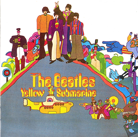
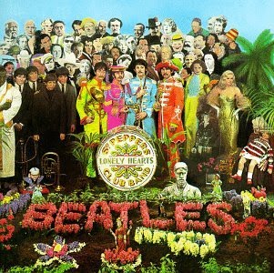
these are are all Beatles album covers, the top is the soundtrack off the yellow submarine film, there isnt much to say about this album cover i just really like the colours that are used and same too for the second album cover which is sgt. peppers lonely hearts club band. i also really like the costume of the main 4 people at the front. it is also clever how they have got lots of famous people included on the front cover which you have to look closely to see. the next is an Anthology by the beatles and i really like how it lokos homemade, by this i mean how it is all cut-out shapes stuck together, and if you look really closely you can see that it is all of their albums stuck together. the final is probably the most famous album cover ever made. this is the reason i like it so much too, because this is such a simple photo of just 4 men walking at the same time across a zebra crossing. they arent wearing matchin clothes however and i think that this is a big reason it works so well. my favourite out of these would have to be the anthology one i think it is very clever and i would like to create something like this myself.


these are all Red Hot Chili albums covers. the first is one hot minute, the only reason i like this album cover is because it has a dark, twisted feel about it because it has a little girl and a fairy on the front cover, but everything is red including her eyes which in this case the red seems to represent anger, her face backs up this feeling too as she is pulling a sedistic face. i really like the second album cover it is Californication. the reason i like it so much is that it is extremely surreal and i like anything like that, it is just a really strange image as it looks like like sky is made of water and the swimming pool is made of sky but made of fire and they have just swapped everything around and it looks brilliant. the last album cover interests me because of the symetrical pattern of the whole image and how hey have included faces into it. i like the tribal pattern coming out of their mouths. i like the black and white colour scheme and how the roses are red and seem bright because of the black and white theme. my favourite of these album covers is Californication though i would love to create a surreal looking optical illusion like this, but it would be very hard to pull off.

.jpg)
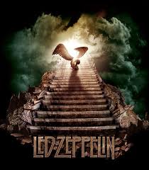

i like the top poster mainly for the main image, it is a very powerful image i would love to do a poster like this but i would not know how to achieve this. it is a symbol of Led Zeppelin relating their products together. the next is a simple photography shit which would be easy to achieve, but i like the place where they are standing and something like this would suit my needs. i also like that it is black and white it looks far more effective in this colour. the next is of a stairway iinto the clouds representing the song stairway to heaven. it has the angel on again from the first poster, but on this he is sitting down. i like the dark colours used and i also like that they always use the same font on each of their posters so you always know it is them. how the light is coming from behind the angel is a really nice touch. i dont understand the last poster all that much it is just a picture of what looks like a pear with eyes, but because of the randomness of this poster it works. it uses the laws of visual heirarchy perfectly and for these reasons it is a good poster.


these are all led zeppelin album covers. the top is Led Zeppelin 4. what i like about this album cover is that its a a picture of a picture hanging on a wall which is just so simple but so effective, i like the texture of the wallpaper too. the second is Houses of The Holy, this is a very strange albujm cover and i wouldnt want naked children on my album cover, i just like how this place is real where the photo is taken and they have changed the hue setting to make it all look un-earthly. the third album cover is Led Zeppelin 3 and i like the randomness of the pictures i think they look very effective, like i have said before i would like bight coloured pictures on a white background possibly it makes the images stand out. i also like the bubble writing. the next album cover is very simple but it cleveryl includes the zeppelin in around the big rock formation without you even realising at first because it looks like a cloud. the final album cover is Physical Graffiti which too looks like a very simple picture, i is an effective recognisable front cover of terraced houses and i want to create a very recognisable front cover too. if you look closely at the windows they have pictures of people in them and if you just glance you dont see them. what i like about these album covers mainly are that they have got hidden depth too them. you have to study the album covers to truely see everything what is on them which represents there music as that too has hidden depths all through their songs.
Thursday, September 16, 2010


 the first two posters are of the same kind of idea, but i think they are brilliant. they have a cartoon image of jimi hendrix and then words making up his hair, moustsache and beard adn all of the words are his song names and there are beautiful patterns running all through them. the enxt poster is very simple for jimi hendrix i just again like his costume and the stance he is using on the picture, it also makes me think to have bright pictures on a plain white backgorund as that would look effective also. the next poster is of jimi hendrix with what looks to be snakes or i think are maybe music jacks which link into his proffesion which is clever. the next poster is also like the music video i want to make so i though i would include it to show what i want to do as it link in perfectly with the kidn of thing i want.

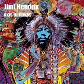


these are all jimi hendrix album covers, i have chosen them because i am a big fan of jimi hendrix and i noticed that his album covers are always really innotive and unusual. the first is a live album cover, the reason i chose it is simply because i like how he has got the gig faded in the background which is a good technique and i could consider using this. the second is axis bold as love which looks very indian in the way that it has got an indian god head on some of the people, i love the colours used as they are very bright, i would want these sort of bold bright colours on my poster and album cover, i also love the symetry i think it looks very effective. the third album cover is the outakes of axis bold as love and it uses the same images basicaly as the former album but distorted and zoomed in. i like the psychadelicness of the whole image and how it kind of looks like layers as it looks like the images are cut outs. the fourth album is are you experienced and on this album too i like the colours which seem to be included on most of his albums (pink and yellow). i also like how the picture is spherical and looks like there are looking out of a crystal ball. the fifth is a best of album cover and it is very simple and there isnt much to say i just like his costume, i really ;like the 60's psychedelic look. and finally the 6th is a blues album by jimi hendrix and i dont know much about blues artists, btu looks as if he has blues artists collaged into his hair and face with pop art used on each. i really like this album cover as i wanted to use a similar effect on my music video with squares and people in them with bright colours, so if i used something along the same lines as this for my album cover it would link in perfectly.


the top picture is a very classic rock poster of all of the band members in the stage clothing looking pretty cool with an amp to show that it is a band. slash is smoking to show maybe that he is the most well known as he is the odd one out, it has very dim lighting and a black background linking this background again to metal. the second is a lovely abstract image involving the two famous guns with a floral pattern along the edged to represent the roses which is clever symbolism.


 these are 2 album covers of guns n roses, the top is the latest album they have done, i like the simplicity of it and the graffiti saying guns n roses to the left of the bike. the second is their most famous album cover names apetite for destruction which too is very similar as it is just a picture on a black background, but i like the symetry of the picture and how the band members are represented by skulls which shows links between rock and metal as sometimes guns n roses are thought of as soft metal.
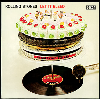

the top image is a pink floyd album cover, i like this cover as i like strange visual imagery and this has a lovely symetrical image of scenery with two big sculputers making the scenery look liek a pattern which i think is very clever. the second is a rolling stones album cover and i like this too as it has what looks like a cake on a record player but if you look closely on the cake it has things like a tyre and a clock in it which i would like to recreate somethign similar as it looks clever. the final album cover is a stone roses album cover containing a moseiac as the background which looks eye pleasing.
rock
rock is my favourite genre of music because it has many different sub genres in it such as; punk rock, alternate rock, heavy rock, classic rock and all of these have completely different sounds, the videos album covers and posters also completely vary from jimi hendrix trippy album covers to queens of the stone age cartoon women posters and i think i will look deep into this genre.
rock is my favourite genre of music because it has many different sub genres in it such as; punk rock, alternate rock, heavy rock, classic rock and all of these have completely different sounds, the videos album covers and posters also completely vary from jimi hendrix trippy album covers to queens of the stone age cartoon women posters and i think i will look deep into this genre.
i like this video, it uses all the conventions of a normal metal video like having zombies in but it uses them in a clever way, it starts in 1938 so it is old fashioned and it all seems like a news report, and then it goes into cartoon about having a war with these zombie people but it is done in a very clever way as it has a narrator all the way through.


the first metallica poster is a very traditional band poster by just having their band name with pictures of them playing there instrument. their second poster is unusual with silhouettes of flying saucers and a man spinning a boy around by his hands, i do not understand the significance of this but i like the colours used and the pattern coming from the band name. the last poster looks like a typical metal poster by havign a gory skull picture, but i do like the effect of the writing.


 as i said on my brief description of metal the front covers have lots of zombies and skulls, the only exception out of these is the metallica front cover at the bottom which has neither skulls or zombies, but it does have what looks like a coffin, but i think it looks clever as to me it looks like theres a silver coffin in a bigger coffin shaped hole which a soily pattern around the outside which i like the idea of.
Tuesday, September 14, 2010
Metal
metal uses dark looking things both in colour and manorisms, by this i mean they always contain skulls or zombies and anything like that is good if you want to make a metal cover. the music is very heavy , as described by the genre name 'metal'. the videos are like the covers involving dark atmospheres created by things like strobe lights and flashing images of blood and strange things.
metal uses dark looking things both in colour and manorisms, by this i mean they always contain skulls or zombies and anything like that is good if you want to make a metal cover. the music is very heavy , as described by the genre name 'metal'. the videos are like the covers involving dark atmospheres created by things like strobe lights and flashing images of blood and strange things.
this is a very typical indie music video as it consists of live action and a story. i like this video though as it shows the live action in a clever way as they show it through a tv as if the singer is watching it and the whole video has a pixelated crispy flickery look about it as if it is all on tv which i think is quite clever.


i like the artic monkeys posters as they are slightly humorous and fit in well with the name of the band, i also liek the colours they have used as they consist of a mix between dull block background colours with bright images. i like the artic monkey poster with just the monkey head because i think the layout looks really well done and i would like to achieve something like this.


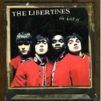


As I have said in my brief indie evaluation, indie album covers show themselves looking like there doing something fun or wrong, this artic monkey’s cover shows it perfectly as it is just a picture of a man smoking and looking stoned. Too with the libertines’ album cover where they look like there up to something. The colourings are usually quite dim, but the covers are easily recognisable because of the main image which is strange because the images are quite bland.
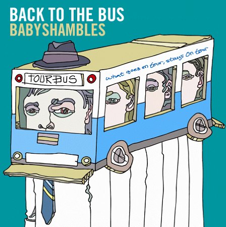
I want to create an easily recognisable album cover like from these indie album covers but I feel they do not do this in a way what suits me or my music, though I do think the album cover ‘Back to the bus’ by ‘the Babyshambles’ is clever and I would like to recreate something along the same lines as it is a clever pun.
I want to create an easily recognisable album cover like from these indie album covers but I feel they do not do this in a way what suits me or my music, though I do think the album cover ‘Back to the bus’ by ‘the Babyshambles’ is clever and I would like to recreate something along the same lines as it is a clever pun.
Subscribe to:
Posts (Atom)